
Every business eventually asks the same question. Is it time to redesign the website? Usually the answer shows up before anyone asks it out loud. Traffic flattens, the team stops trusting the numbers, or someone finally says the site looks like it is from another decade. None of those are wrong reasons to look at a redesign, but they are not the best ones either. The businesses that get real value from a redesign start with a different question. What is actually broken, and will a new design fix it.
The Real Signs You Need a Redesign
Looking dated is the reason most people notice a site needs work, but it is rarely the reason that actually justifies the project. A site can look a little behind the times and still be doing its job. The signs worth acting on are the ones showing up in the numbers and in your own team's frustration, not just the visual polish.
It Is Not About Looking Old
Before you brief a designer, get honest about what is really going wrong. A visual refresh will not fix any of these problems on its own:
- Conversion rate has been sliding for months with no clear cause
- Bounce rate is high on the pages that should be doing the most work
- Nobody on your team can update content without calling the developer
- The site technically 'works' on mobile, but it was clearly built for desktop first
- Your team is afraid to touch the codebase because nobody trusts what will break
If one or two of these sound familiar, that is your actual brief. The redesign should be built to fix those specific problems, not just to look newer.
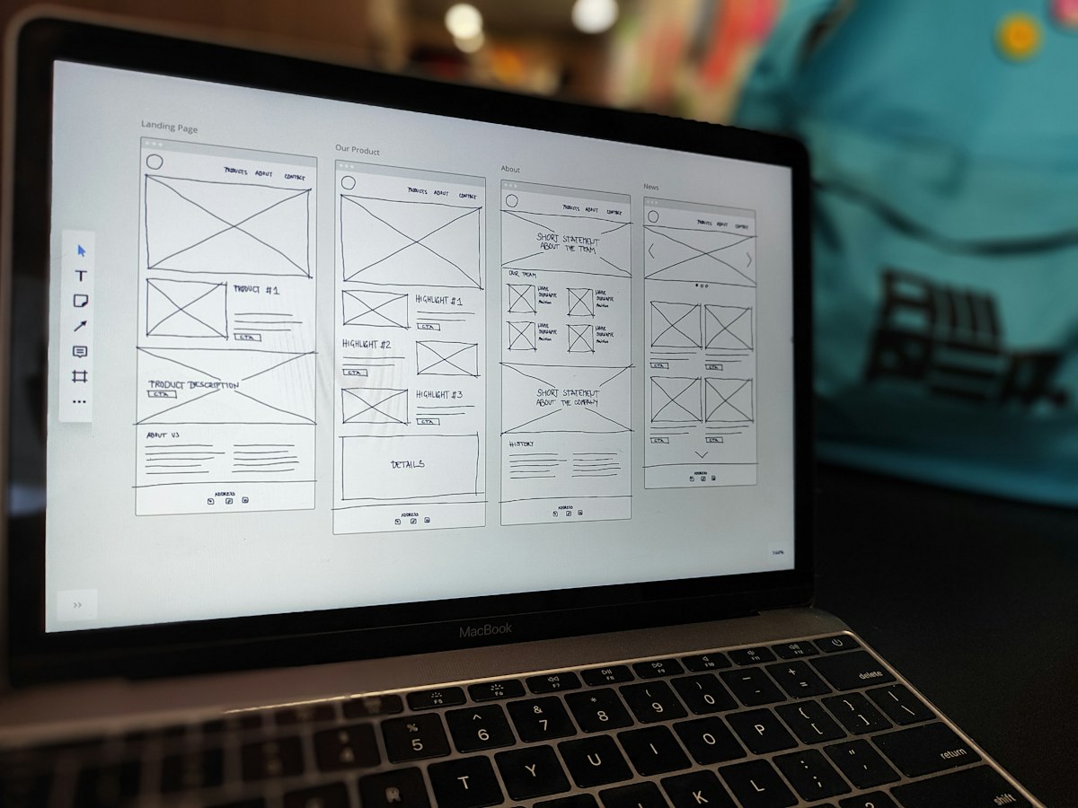
Page Speed and Core Web Vitals Are the Real Trigger
A slow site is one of the most common reasons a redesign gets greenlit, even when nobody uses that language internally. People rarely say their Core Web Vitals are bad. They say the site feels sluggish, or that people seem to be leaving before it even loads. Those are the same problem described two different ways.
What the Vitals Actually Measure
Core Web Vitals is Google's framework for scoring real user experience: how fast the main content loads, how quickly the page responds when someone actually interacts with it, and whether the layout jumps around while it is loading. None of that is abstract. It is the difference between a visitor who sticks around and one who bounces back to the search results.
Here is the part that trips people up during a redesign: a new site can make this worse, not better, if performance is not part of the brief from day one. Heavy page builder animations, uncompressed images, and bloated third-party scripts are an easy way to ship a site that looks sharper and loads slower than the one it replaced. Speed has to be a design requirement, not a fix for later.
Mobile-First Is Not a Trend Anymore, It Is the Baseline
For most businesses, the majority of traffic is already arriving on a phone. Treating mobile as a secondary version of the 'real' desktop site is backwards, and it shows up immediately in how a redesign gets used. Design and content decisions should start on the smallest screen and scale up, not the other way around. Navigation that makes sense on a laptop trackpad often falls apart under a thumb, and that gap is exactly where redesigns quietly lose visitors.
Accessibility Belongs in the Brief, Not the Afterthought Pile
Accessibility gets treated as a nice-to-have far too often, usually because it gets raised after the design is already locked. It is cheaper and far more effective to build it in from the start than to patch it in after launch.
The Basics That Get Skipped
- Text and background colors that actually meet contrast standards, not just ones that look fine to the designer
- Alt text on images that describes what is actually there, not a keyword dump
- A site that can be navigated with a keyboard alone, not just a mouse or a finger
- Form fields with real labels instead of placeholder text that disappears the moment someone starts typing
None of this is exotic. It is also good for everyone using the site, not just the subset of visitors it is technically written for.
Content Strategy Comes Before Visual Design
One of the most common redesign mistakes is starting with the visuals and dropping in placeholder text later. It produces a site that looks finished and reads like nobody thought about what it needed to say. Content strategy, meaning what pages exist, what each one needs to accomplish, and how a visitor actually moves between them, should be settled before anyone opens a design file. A homepage built around real copy and a real user journey will always outperform one built around a template that content gets forced into afterward.

Protecting the SEO You Already Have
A redesign can quietly wipe out years of ranking progress if nobody is watching for it, and it usually happens for avoidable reasons. This is the part of the project that gets rushed because it is not visible to anyone admiring the new design.
URL Structure and Redirects
Before a single new page goes live, know exactly which of your current URLs are actually ranking and sending traffic. If the new site structure changes those URLs, every single one needs a proper redirect to its closest equivalent on the new site. Skipping this step, or handling it carelessly with blanket redirects to the homepage, is one of the fastest ways to lose organic traffic overnight. If a URL does not need to change, do not change it just because the rest of the site did.
- Audit current top-performing pages before touching the sitemap
- Map every old URL to its new equivalent, not just the ones that seem important
- Set 301 redirects and test them before launch, not after
- Keep titles and meta descriptions intact on pages that are not fundamentally changing
A redesign is worth doing when it solves a problem you can actually name. Speed, structure, mobile behavior, accessibility, and content that matches how people actually use the site will always matter more than which layout trend is popular this year. Get those right and the design will hold up long after the trends move on.